Card
<sl-card> | SlCard
Cards can be used to group related subjects in a container.
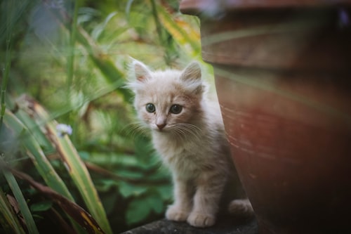 Mittens
This kitten is as cute as he is playful. Bring him home today!
6 weeks old
<sl-card class="card-overview">
  <img
    slot="image"
    src="https://images.unsplash.com/photo-1559209172-0ff8f6d49ff7?ixlib=rb-1.2.1&ixid=eyJhcHBfaWQiOjEyMDd9&auto=format&fit=crop&w=500&q=80"
    alt="A kitten sits patiently between a terracotta pot and decorative grasses."
  />

  <strong>Mittens</strong><br />
  This kitten is as cute as he is playful. Bring him home today!<br />
  <small>6 weeks old</small>

  <div slot="footer">
    <sl-button variant="primary" pill>More Info</sl-button>
    <sl-rating></sl-rating>
  </div>
</sl-card>

<style>
  .card-overview {
    max-width: 300px;
  }

  .card-overview small {
    color: var(--sl-color-neutral-500);
  }

  .card-overview [slot='footer'] {
    display: flex;
    justify-content: space-between;
    align-items: center;
  }
</style>
Examples
Basic Card
Basic cards aren’t very exciting, but they can display any content you want them to.
<sl-card class="card-basic">
  This is just a basic card. No image, no header, and no footer. Just your content.
</sl-card>

<style>
  .card-basic {
    max-width: 300px;
  }
</style>
Card with Header
Headers can be used to display titles and more.
Header Title
This card has a header. You can put all sorts of things in it!
<sl-card class="card-header">
  <div slot="header">
    Header Title
    <sl-icon-button name="gear" label="Settings"></sl-icon-button>
  </div>

  This card has a header. You can put all sorts of things in it!
</sl-card>

<style>
  .card-header {
    max-width: 300px;
  }

  .card-header [slot='header'] {
    display: flex;
    align-items: center;
    justify-content: space-between;
  }

  .card-header h3 {
    margin: 0;
  }

  .card-header sl-icon-button {
    font-size: var(--sl-font-size-medium);
  }
</style>
Card with Footer
Footers can be used to display actions, summaries, or other relevant content.
<sl-card class="card-footer">
  This card has a footer. You can put all sorts of things in it!

  <div slot="footer">
    <sl-rating></sl-rating>
    <sl-button variant="primary">Preview</sl-button>
  </div>
</sl-card>

<style>
  .card-footer {
    max-width: 300px;
  }

  .card-footer [slot='footer'] {
    display: flex;
    justify-content: space-between;
    align-items: center;
  }
</style>
Images
Cards accept an image slot. The image is displayed atop the card and stretches to fit.
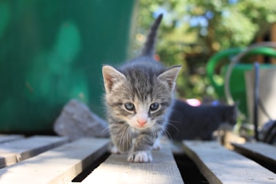 This is a kitten, but not just any kitten. This kitten likes walking along pallets.
<sl-card class="card-image">
  <img
    slot="image"
    src="https://images.unsplash.com/photo-1547191783-94d5f8f6d8b1?ixlib=rb-1.2.1&ixid=eyJhcHBfaWQiOjEyMDd9&auto=format&fit=crop&w=400&q=80"
    alt="A kitten walks towards camera on top of pallet."
  />
  This is a kitten, but not just any kitten. This kitten likes walking along pallets.
</sl-card>

<style>
  .card-image {
    max-width: 300px;
  }
</style>
Slots
| Name | Description |
|---|---|
| (default) | The card’s main content. |
header
|
An optional header for the card. |
footer
|
An optional footer for the card. |
image
|
An optional image to render at the start of the card. |
Learn more about using slots.
Custom Properties
| Name | Description | Default |
|---|---|---|
--border-color |
The card’s border color, including borders that occur inside the card. | |
--border-radius |
The border radius for the card’s edges. | |
--border-width |
The width of the card’s borders. | |
--padding |
The padding to use for the card’s sections. |
Learn more about customizing CSS custom properties.
Parts
| Name | Description |
|---|---|
base |
The component’s base wrapper. |
image |
The container that wraps the card’s image. |
header |
The container that wraps the card’s header. |
body |
The container that wraps the card’s main content. |
footer |
The container that wraps the card’s footer. |
Learn more about customizing CSS parts.