Image Comparer
<sl-image-comparer> | SlImageComparer
Compare visual differences between similar photos with a sliding panel.
For best results, use images that share the same dimensions. The slider can be controlled by dragging or pressing the left and right arrow keys. (Tip: press shift + arrows to move the slider in larger intervals, or home + end to jump to the beginning or end.)
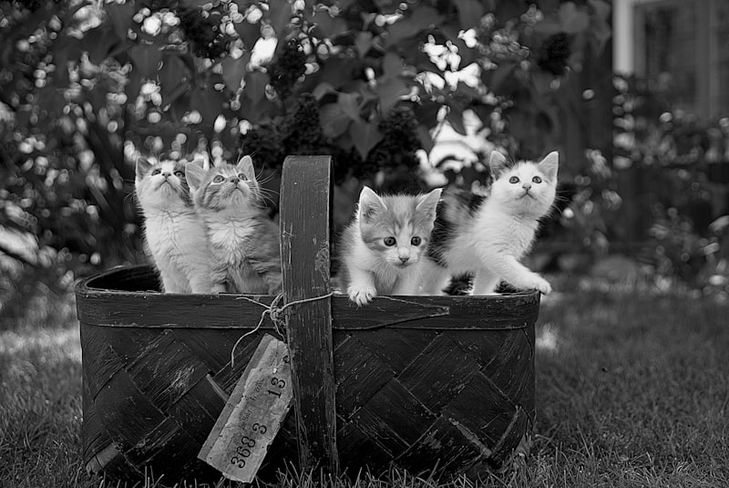

<sl-image-comparer>
  <img
    slot="before"
    src="https://images.unsplash.com/photo-1517331156700-3c241d2b4d83?ixlib=rb-1.2.1&ixid=eyJhcHBfaWQiOjEyMDd9&auto=format&fit=crop&w=800&q=80&sat=-100&bri=-5"
    alt="Grayscale version of kittens in a basket looking around."
  />
  <img
    slot="after"
    src="https://images.unsplash.com/photo-1517331156700-3c241d2b4d83?ixlib=rb-1.2.1&ixid=eyJhcHBfaWQiOjEyMDd9&auto=format&fit=crop&w=800&q=80"
    alt="Color version of kittens in a basket looking around."
  />
</sl-image-comparer>
Examples
Initial Position
Use the position attribute to set the initial position of the slider. This is a percentage from
0 to 100.
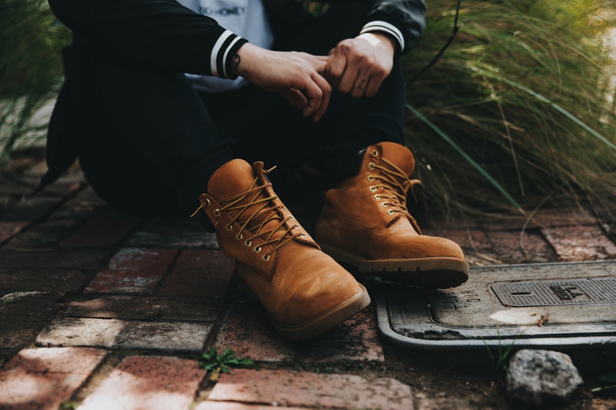
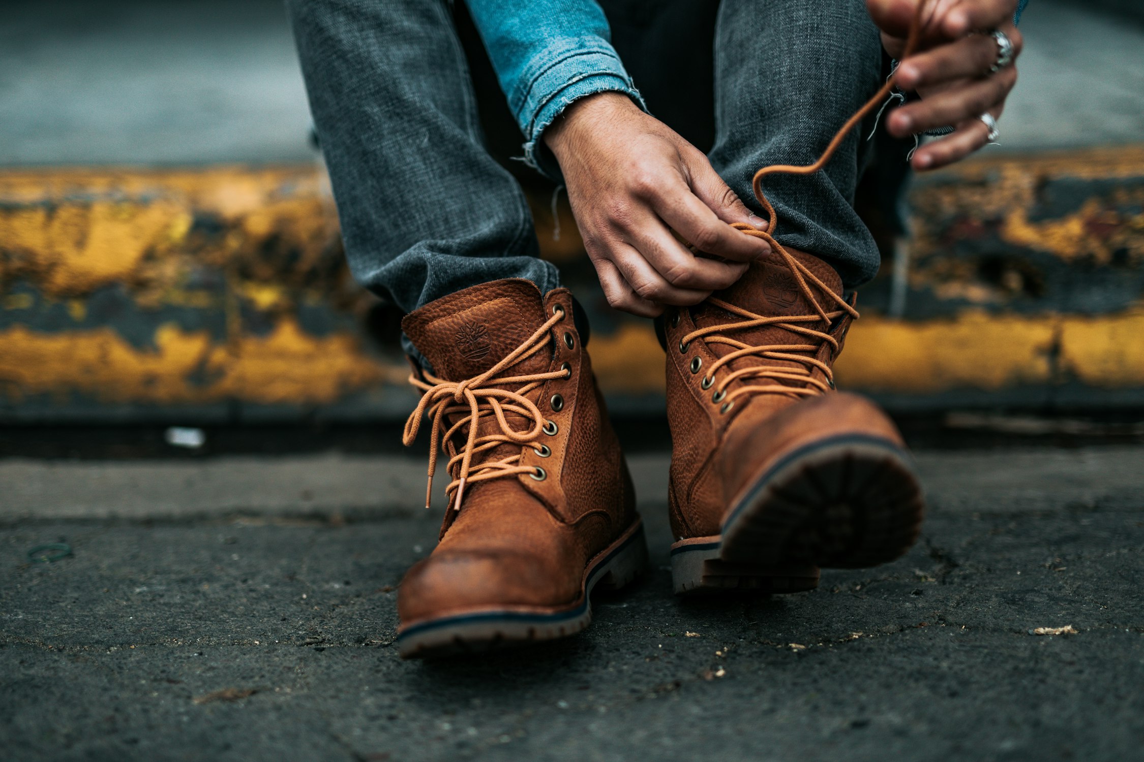
<sl-image-comparer position="25">
  <img
    slot="before"
    src="https://images.unsplash.com/photo-1520903074185-8eca362b3dce?ixlib=rb-1.2.1&ixid=eyJhcHBfaWQiOjEyMDd9&auto=format&fit=crop&w=1200&q=80"
    alt="A person sitting on bricks wearing untied boots."
  />
  <img
    slot="after"
    src="https://images.unsplash.com/photo-1520640023173-50a135e35804?ixlib=rb-1.2.1&ixid=eyJhcHBfaWQiOjEyMDd9&auto=format&fit=crop&w=2250&q=80"
    alt="A person sitting on a yellow curb tying shoelaces on a boot."
  />
</sl-image-comparer>
Slots
| Name | Description |
|---|---|
before
|
The before image, an <img> or <svg> element. |
after
|
The after image, an <img> or <svg> element. |
handle
|
The icon used inside the handle. |
Learn more about using slots.
Properties
| Name | Description | Reflects | Type | Default |
|---|---|---|---|---|
position
|
The position of the divider as a percentage. |
|
number
|
50
|
updateComplete |
A read-only promise that resolves when the component has finished updating. |
Learn more about attributes and properties.
Events
| Name | React Event | Description | Event Detail |
|---|---|---|---|
sl-change |
|
Emitted when the position changes. | - |
Learn more about events.
Custom Properties
| Name | Description | Default |
|---|---|---|
--divider-width |
The width of the dividing line. | |
--handle-size |
The size of the compare handle. |
Learn more about customizing CSS custom properties.
Parts
| Name | Description |
|---|---|
base |
The component’s base wrapper. |
before |
The container that wraps the before image. |
after |
The container that wraps the after image. |
divider |
The divider that separates the images. |
handle |
The handle that the user drags to expose the after image. |
Learn more about customizing CSS parts.
Dependencies
This component automatically imports the following dependencies.
<sl-icon>